01 / Design system
A design system for newsroom software, and the features built on it
Four months and ten releases: a design system Sourcera's frontend now installs as a package, and the product screens I redesigned on it, from search and triage to claim review, settings and onboarding.
Context
Media tech / AI publishing
Sourcera, a content engine in production at finanzen.net, FUNKE Digital and HYPER
May to September 2026. Figures from the system's changelog, RFCs and feature docs.
Role
Me — The system end to end: principles, tokens, components, RFCs, docs site and npm package. Then the feature redesigns built on it.
Team — Sourcera's founders and platform engineers
Tools — Figma, Claude Code, claude.ai/design, React, Tailwind v4
The constraint
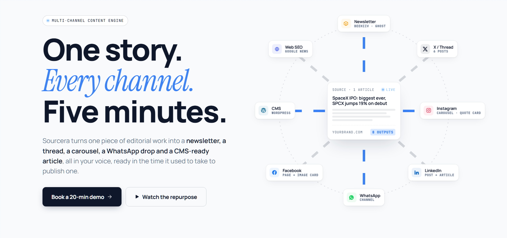
Sourcera turns one piece of editorial work into a newsletter, a thread, a carousel, a WhatsApp drop and a CMS-ready article, and cuts editing time per story from 30+ minutes to under five. Its users are editors who work through 50+ items a day, in queues, as a team, and the brief named two things as non-negotiable: clear status and a clear next action.
The product had grown one screen at a time. Three queue tables, for sources, press releases and deep dives, had been built separately and had drifted apart, down to their cell padding. Buttons came in 44, 40, 38 and 24px. The frontend kept a hand-copied token file and 35 hand-written Tailwind aliases, next to a second token system from shadcn that used the same variable names. More queue screens were on the way, and each one would have copied the drift. So the system had to be something engineers install, not something they copy.
Principles, written first
Before a single component, I wrote six principles for every screen to answer to, each with a reason, a do and a don't. They are the system's constitution: when a review gets stuck, it defers to them.
01
The next action is always obvious
Editors live in queues, so every screen answers what to do next within a second. One primary button per surface, and no empty state without one.
02
Status is always visible
Idea, Draft, In review, Scheduled, Published, Archived. One scale everywhere, never a label invented for one screen.
03
Collaboration is a first-class layer
Who's editing, who reviewed and who's assigned show up on the work itself, not behind a notification icon.
04
Speed over decoration
At 50+ items a day, a keyboard shortcut on every primary action and a compact mode for queues beat any animation.
05
Editorial gravitas, operational clarity
Newsreader serif for headlines and the editor, Geist sans for chrome and data, and never the serif on a button or a table.
06
One source of truth per token
Components reference semantic tokens, never raw hex, so a theme changes without a redesign.
Foundations
Type
Newsreader, Geist and Geist Mono, self-hosted as 22 woff2 files covering English and German. No CDN and no network call.
Colour
One Editorial Blue carries every primary action, link and focus ring. Status hues mean status only, and product UI has no gradients.
Controls
One 34px height for buttons and selects. Hierarchy comes from fill and weight: one filled primary per surface, then secondary, ghost and danger.
Access
WCAG 2.2 AA is the floor. Body text sits at 13:1, status is never shown by colour alone, and every disabled control says why.
Decisions that shaped the system
01
Tried — Let the frontend keep its own copy of the tokens and hand-maintain its Tailwind aliases.
Learned — Copies drift. Someone had to add --color-danger-strong by hand the day they needed it, and shadcn's variables at :root defined --background, --border and --primary too, so unscoped tokens would collide.
Did — Made one CSS file the single source and generated everything else from it: scoped CSS, a Tailwind v4 theme, TypeScript types and a DTCG export. Editing a token is one file and one command, and every token lives under .sourcera-ds so it can't collide.
02
Tried — Keep building each queue table by hand for its own screen.
Learned — The three existing tables had already drifted: 12px cells in one, 16px in another, and three slightly different takes on selection, filtering and the batch toolbar. A written pattern couldn't have stopped that.
Did — Wrote RFC-001 and designed one DataTable where the column is the unit of configuration. Sorting, three filter types, selection, the batch toolbar and keyboard paths are built in, so the next queue is a schema, not a build.
03
Tried — Size buttons to their context, with 44, 40, 38 and 24px variants.
Learned — Size wasn't what made a button primary; fill and weight were. And a disabled button said you couldn't act, but never why.
Did — Collapsed every button to one 34px height with four variants, and made disabledReason part of the API: the reason shows on hover and focus and reaches screen readers. A disabled control without a reason is now a defect.
04
Tried — My own rule from RFC-001: a row click selects and never navigates, and an explicit button opens the record.
Learned — Opening is the common act and selecting the rare one. Each screen reinvented its Open button, first-time users clicked a row and got a selection, and reviewers paid two clicks per record across a 60-item queue.
Did — Reversed it in RFC-003. A row click opens, always, and a 44px selection zone at the start of the row selects, with shift-click ranges, ⌘-click for a new tab and j, k, x and Enter on the keyboard. It's opt-in, so screens migrate one at a time.
Features built on the system
Nine product screens were redesigned on the system's own parts. Each one replaces a real, named screen instead of restyling it, and its write-up starts with what was wrong.
Search, start screen
Topics become the canvas
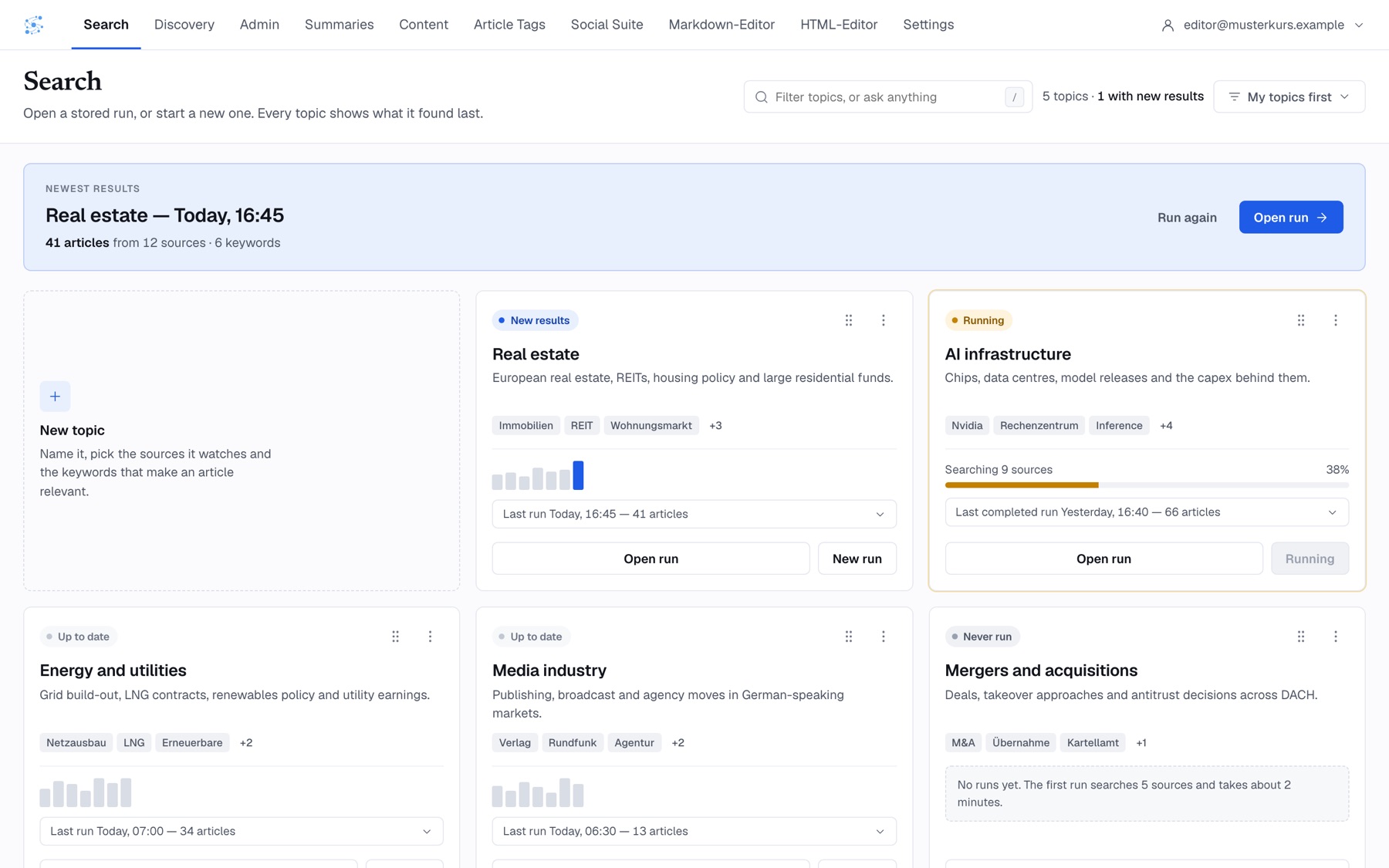
Before — Search opened on a 430px form rail beside a stock illustration that filled three quarters of the screen. Nothing was visible until you ran a search, which bills scraping credits and takes minutes, and the choice between a free stored run and a paid new one was an unlabelled dropdown of timestamps.
After — Every topic is a card with its own status, recent volume, last run and next action, so you can see what came in overnight without spending anything. The form only appears when you create or edit a topic.
Search, results
Triage from the keyboard
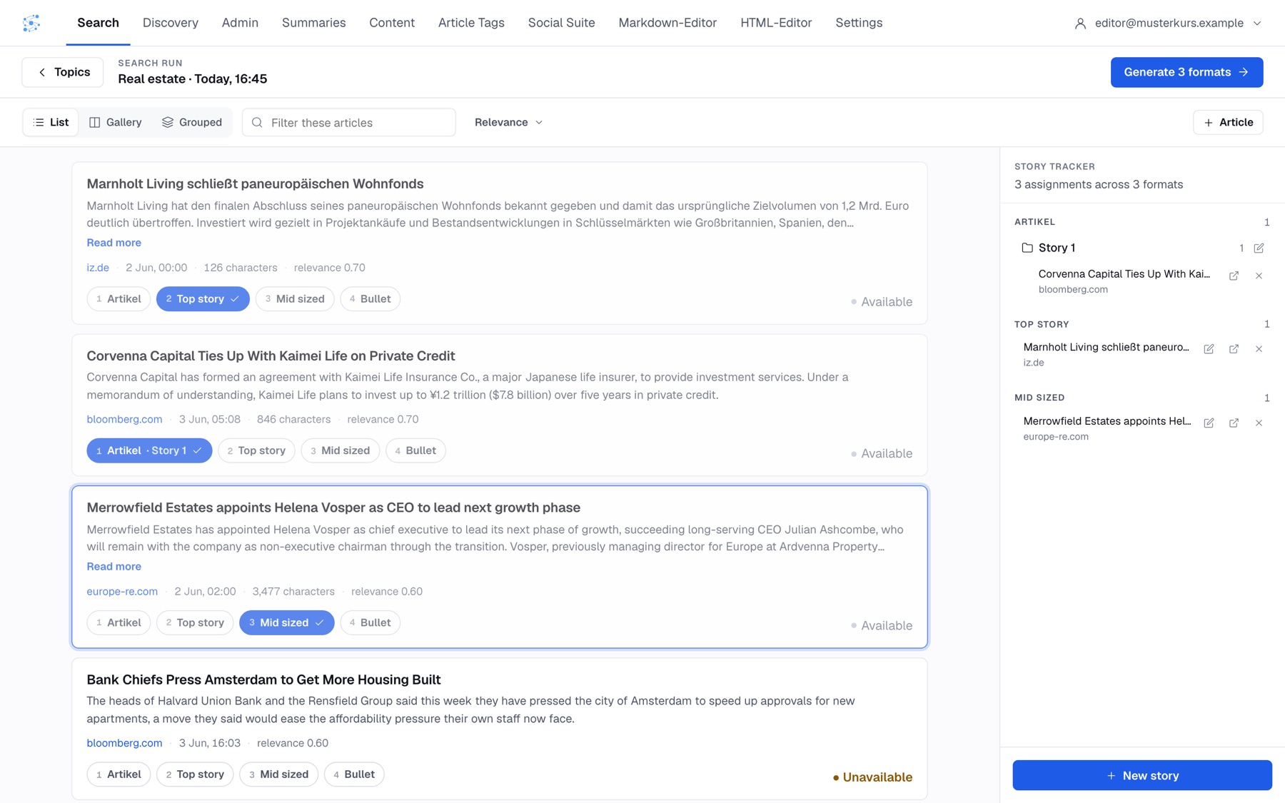
Before — A run of 118 articles showed no real progress. Four radio buttons pretended to pick one format while storing several, choosing a story expanded a tree inside the row and pushed the list down, and there was no keyboard path at all.
After — Formats are multi-select chips with number keys, the story picker is a popover so rows never move, and j, k and 1–4 triage the queue without the mouse. A half-made assignment turns amber in the row and in the docked story tracker, and a Grouped view clusters the same story from different outlets, so a wire run is triaged once per story. The one primary button names exactly what it will generate.
Review flow
Every claim next to its source
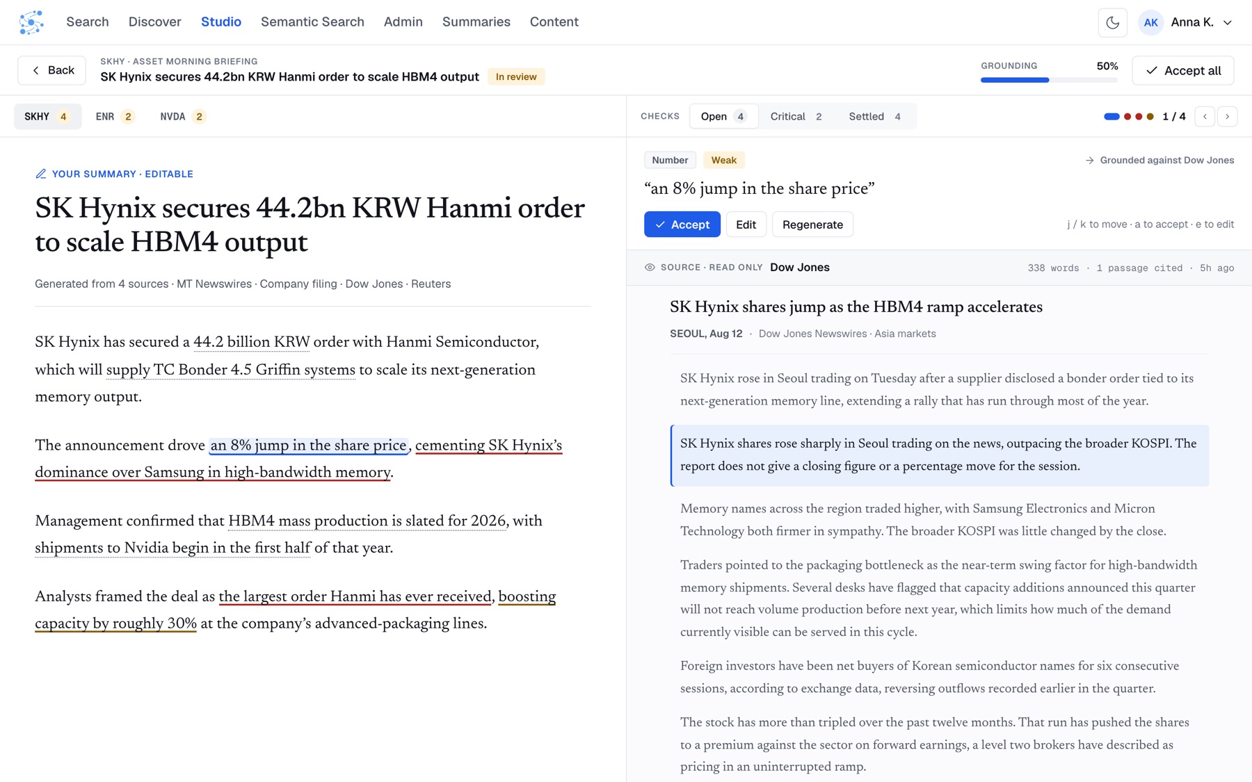
What it does — A generated summary is only as good as its weakest claim. The review flow puts the draft on the left and its source articles on the right, marks each claim in place and sorts the checks into Open, Critical and Settled. j and k move between claims, a accepts and e edits.
The detail — Approving while checks are still open turns the button amber: a proceed-with-caution primary with its own tokens, kept separate from the amber of a warning, so the two can be tuned independently.
Settings
One save model, and every cost stated
Before — Four settings tabs shared one Save and one Reset. Save did nothing on two of the tabs, because connections and consent commit the moment they change, and Reset on the Search tab quietly wiped your brand colours and logo.
After — Every setting saves on change and offers an undo that restores the previous value, not the default. Reset is scoped to its own section and names what it will touch, consent changes are recorded in the audit log instead of offering a false undo, and every costly option states its cost in the option itself.
Onboarding
Connect, don't upload
Before — Setup was a document-upload form that asked every client the same six questions, whatever they actually do with the product.
After — The plan decides the flow, so nobody is asked what they do. Clients connect WordPress, Beehiiv, Ghost, Instagram or LinkedIn instead of uploading files, a tour runs while the workspace builds, and the Ready screen already holds a first analysis: what you're good at, what to try and what to stop.
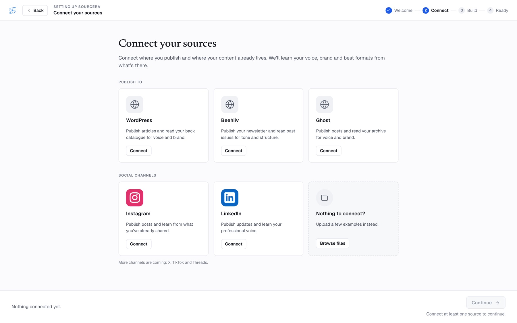
Also built on the system: Content and Summaries as DataTable screens, an Analytics overview with one measurement spine across six channels, an Editorial desk, a brand editor that previews one brand on slides, newsletters and charts, and a conversational post composer.
How I worked
RFCs for anything permanent
New screens start as prototype UI kits and move into the component library only when a second surface needs them. That move is a permanent API, so it takes a one-page RFC: problem, options, recommendation, token impact and migration. DataTable, Select, live search and row opening each had one.
Design where the product lives
Most new screens have to sit next to existing ones, so I designed them in the repo with Claude Code, reading the real frontend and checking every change as a screenshot. claude.ai/design is for exploring directions, and the two round-trip file for file.
Docs that can't drift
The docs site, token browser and 35 preview cards are generated from the repo on every deploy, and the build fails when a component stops using its tokens.
Ports are pixel-checked
Designs brought over from the design tool were diffed against the original at 1440×900. The Content screen matched in all 23 states, to the pixel.
Impact
- One DataTable replaced three hand-built queue tables, and Content, Newsroom and Review Flow now open, select and batch rows the same way.
- The platform frontend dropped its hand-copied tokens and installs
@sourcera/design-system. The migration surfaced three packaging bugs, all fixed in the next patch release. - 197 Tailwind theme entries are generated from one CSS file, where 35 used to be written by hand.
- Every button is one 34px height, and a disabled control without a stated reason is treated as a defect.
- Ten releases in four months, from v0.1.0 on May 14 to the v0.4.0 release candidate on September 18, each one documented in the changelog.
- Nine feature redesigns built from the system's own parts, from search and triage to settings and onboarding.
What's still open
Nothing yet checks automatically that two component variants render identically, which the design tool does, so that still relies on screenshots and review. And each feature design lists its open questions before it ships: 7 in onboarding, 11 in search and 12 in settings.